Pareto Diagram/Chart
Pareto Chart Job Aid
A Pareto chart is a type of bar graph. This chart is based off of the Pareto principle (aka the 80- 20 rule) that states that in most cases 80% of the effects come from 20% of the causes. This principle was developed by Vilfedo Pareto, an Italian mathematician, who showed that 80% of the land in Italy was owned by 20% of the population.
On this chart the left vertical axis represents frequency, the right vertical axis represents cumulative percentage, and the horizontal axis represents the data being examined. A line graph, which shows the cumulative total, is also present on the bar graph. The graph is arranged with the longest bars on the left and the shortest bars on the right.
How is it used?
The purpose of this chart is to highlight the significant and insignificant factors in a given situation. The chart helps to determine the causes with the greatest impact. It clearly displays the data so that it is easy to determine what factors are more influential than others.
Why is it used?
The chart can be used to analyze data about the frequency of problems or causes in a process; if you have multiple problems or causes and you want to determine which are the most significant; of you want to analyze broad causes by looking at specific components; or if you want to communicate with others about your data.
The chart is frequently used in quality control to highlight the most important among a set of factors.
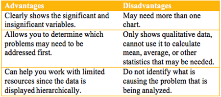
Advantages and disadvantages of use?
A Pareto chart is a type of bar graph. This chart is based off of the Pareto principle (aka the 80- 20 rule) that states that in most cases 80% of the effects come from 20% of the causes. This principle was developed by Vilfedo Pareto, an Italian mathematician, who showed that 80% of the land in Italy was owned by 20% of the population.
On this chart the left vertical axis represents frequency, the right vertical axis represents cumulative percentage, and the horizontal axis represents the data being examined. A line graph, which shows the cumulative total, is also present on the bar graph. The graph is arranged with the longest bars on the left and the shortest bars on the right.
How is it used?
The purpose of this chart is to highlight the significant and insignificant factors in a given situation. The chart helps to determine the causes with the greatest impact. It clearly displays the data so that it is easy to determine what factors are more influential than others.
Why is it used?
The chart can be used to analyze data about the frequency of problems or causes in a process; if you have multiple problems or causes and you want to determine which are the most significant; of you want to analyze broad causes by looking at specific components; or if you want to communicate with others about your data.
The chart is frequently used in quality control to highlight the most important among a set of factors.
Advantages and disadvantages of use?
Real World examples of use?
This chart can be used in a business setting to identify possible problem areas. For example, if you run a business that is having issues in the customer service department you can identify the top customer complaints and display them on the chart based upon the frequency of each complaint. You could then identify what areas of customer service may need to have the most focus such as friendliness, resolution of problem, etc.
Resources and Bibliography
Cause & effect diagram and pareto analysis. (n.d.). BrainMass. Retrieved from https://brainmass.com/health-sciences/topics-in-health-and-wellness/cause-effect- diagram-and-pareto-analysis-498225
Pareto chart. (2015). Wikipedia. Retrieved from https://en.wikipedia.org/wiki/Pareto_chart
Pareto chart. (n.d.). American Society for Quality. Retrieved from http://asq.org/learn-about- quality/cause-analysis-tools/overview/pareto.html
Pareto Principle: How to use it to dramatically grow your business. (2014). Forbes. Retrieved from http://www.forbes.com/sites/davelavinsky/2014/01/20/pareto-principle-how-to-use- it-to-dramatically-grow-your-business/#16990aad1259
